
Friday, December 13, 2013


Wednesday, December 4, 2013


Monday, December 2, 2013
CONCENTRATION IN PROGRESS
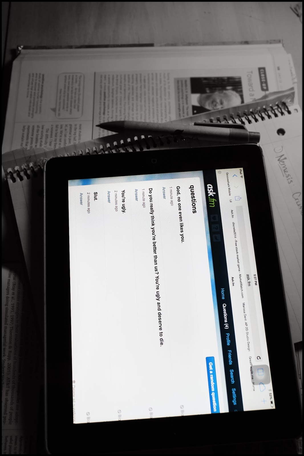
I changed my concentration theme in order to have a successful concentration over break. I think I am still going to pursue the Senior Year theme but extend it throughout the entire year. My new theme is about how technology is always around in everyday life, and ultimately consumes us. It is also about how people are obsessed with expressing themselves through social media, and always making sure people know what is going on at all times.


Friday, November 22, 2013


Thursday, November 14, 2013
Concentration In Progress


Tuesday, November 12, 2013


Thursday, November 7, 2013
Silk Painting

4.A There is successful use of the elements of design, but the investigation of 2-D design
principles is limited in scope.
4.B Some clear decision making and intention are evident
4.E Some of the work has evocative qualities that engage the viewer, though confidence is not
obvious; conversely the work may display confidence but not be engaging.
Tuesday, October 22, 2013
Dushanbe, BMoCA, and Pearl St Field Trip


Monday, October 14, 2013

Sunday, October 6, 2013
4 Picture Narrative Series
I struggled with an idea but eventually came up with the idea of the darkness overtaking someone until they're reduced to almost nothing. The first three pictures are of Taylor Wild and the last is of a street performer on Pearl Street. As each photo progresses, the figure becomes more and more closed off. In the first, she is simply walking towards the darkness, but in the ones following, it actually begins to consume her. Each picture and the clothing get darker with each picture.


Monday, September 30, 2013

Thursday, September 26, 2013

I used record covers, record shards, playing cards, sharpies, nail polish, transparencies, spray paint, fabric, duct tape, images from other record covers, and white cardboard. I only adjusted brightness in Photoshop and added some yellow brush in the middle to connect the bottom left corner to the middle.
Wednesday, September 4, 2013

Tuesday, September 3, 2013


Summer Art: I have a sort of obsession with street signs so I tried to photograph them in a way that focused on the colors and even minute textures of the signs and I tried to turn an everyday object into an eye-catching photograph. I selected the background in both images and desaturated them to make the colors pop even more and I raised both contrast and brightness and adjusted curves and levels. Both of these were taken in Old Town Louisville.


I focused highly on the center of the sunflower and the stem which caused the leaves to have very clear, crisp lines. I took the shot in monochrome and in Photoshop, I duplicated the layer and added a gaussien blur at about 32%. Then I added a thin black border to tie the picture together.


Like the first, this summer art was my attempt at stretching my comfort zone and doing more mixed media as opposed to my usual photopure technique. I did heavy makeup on my little sister to create a dramatic effect and I added filters to both the eyeshadow and her hair. This made the image appear more like a drawing than a photo.

Subscribe to:
Comments (Atom)